By Eric Smith
Fleet Feet decided that the company’s longtime logo could no longer keep pace in today’s fast-moving business landscape, so at last week’s franchise conference in Minneapolis, the company’s leadership team unveiled a brand refresh that signals a new leg in the retailer’s journey.
“We’re a brand 42 years in the making—or as we like to say, 42 years of a lot of sleepless nights,” Fleet Feet CEO Joey Pointer told SGB.
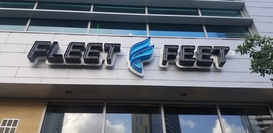
Those many sleepless nights yielded a rebranding campaign that includes a few new features. The most prominent is the addition of a “torch” image placed in between “Fleet” and “Feet” in the company’s logo.
![]()
“The base of the logo symbolizes the spark of inspiration provided by Fleet Feet to runners, while the top portion represents the flames of commitment fanned by the brand through its staff, gear and programs,” the company said in a press release.
The logo also drops the word “Sports” from the company’s name. Pointer, who spoke with SGB at the franchise conference last week (read the SGB Executive Q&A), said this allows local franchises to better incorporate their hometown in store signage and marketing efforts, so “Fleet Feet Memphis” or “Fleet Feet Austin” (whose store sign is pictured above) instead of the more generic “Fleet Feet Sports.”
Besides, he added, customers rarely used the “Sports” when mentioning the store name and associates rarely used it when answering the phone. “And the city name is important to us since the stores are locally owned and operated,” Pointer added.
On top of that, removing “Sports” makes the stores more inclusive to customers who are shopping for products beyond the realm of sports, such as casual wear. At the same time, he said, “We want to own the sport of running and be sort of the authoritative leader. Any surface, any distance, any level, whether that’s cross country, track and field, trail, a growing sport and, of course, the road, where we’ve really dominated over the last 40 years.”
The refresh will be at the heart of the brand’s new digital campaign, “Let’s Go,” which Fleet Feet will roll out across social media over the next several months. The company even made a video to showcase the campaign:
Though Carrboro, NC-based Fleet Feet debuted the logo—which looks like an “F,” giving it a dual purpose—to stores and vendors last week, the company didn’t unveil the rebranding to the general public until Tuesday.
The logo changes, which also feature new fonts and color schemes, better capture the spirit of the 42-year-old retailer, Pointer said. Still, the move wasn’t without risk. While he wanted to bring an iconic image to Fleet Feet’s logo in the way that Starbucks and Lululemon are easily identified by their siren and stylized A, respectively, he understood that changing a company’s look and feel is laden with pitfalls.
“I lost the most amount of sleep over changing that mark,” Pointer said. “I didn’t want to be the guy that invented new Coke and it was a complete fiasco.”
 The updated logo is being rolled out on fleetfeet.com and the brand’s national social media accounts. Stores will adopt a rolling change starting Tuesday for all digital assets, with printed assets following behind over the next several months. The new logo also will be incorporated in some co-branding efforts, including a shoe with Brooks and an insole with Superfeet, in addition to private label footwear and apparel.
“For over 30 years, our previous logo worked because of the effort our owners and staff put into giving it meaning through their actions in their communities,” said Brent Hollowell, vice president of marketing and vendor management for Fleet Feet. “This new logo builds upon those actions while modernizing and strengthening it for use digitally, on private label gear and apparel and out in the community.”
Fleet Feet, whose footprint now includes 176 locations in 37 states, continues to honor the company’s storied past while also moving forward. The company last year rebranded its running groups as Fleet Feet Running Clubs as a nod to their former name. And a new collaboration with Brooks will also pay tribute to the house where Fleet Feet was founded in Sacramento, as well as the colors and styles of the 70s.
But while the old logo and branding position served the company well for 30 years, “times have changed,” Pointer added. “We live in a digitally native society, and it just wasn’t the right logo for that. As we talked about our brand and our essence, Fleet Feet is all about inspiring and empowering. I could list story after story of how, over the last 42 years, that’s our brand truth; that’s our essence.”
“When you overlay our vision to inspire the runner and our mission of empowering anyone who runs, that is fundamental.”
Photos and video courtesy Fleet Feet
[author] [author_image timthumb=’on’]https://s.gravatar.com/avatar/dec6c8d990a5a173d9ae43e334e44145?s=80[/author_image] [author_info]Eric Smith is Senior Business Editor at SGB Media. Reach him at eric@sgbonline.com or 303-578-7008. Follow on Twitter or connect on LinkedIn.[/author_info] [/author]