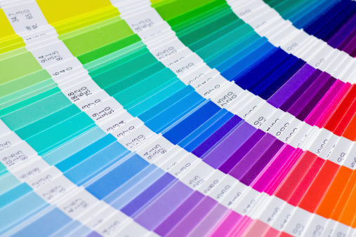
Pantone is color’s universal language. Much more than a a color spectrum, it inspires professionals and industries around the world.
Since 1963, Pantone has created more than 10,000 standard color chips, which designers and manufacturers use to make sure that products are consistently the same color, no matter where and how they’re made.
For example, when the Coca-Cola company prints its logo on different merchandise, it is always in the same tone of red, known as “Coke Red”. How do they make sure it is always the same red printed all of the time? Coke Red is actually PMS 484, as indicated in the Pantone Matching System or PMS. It is the exact mix and formula for this particular color and the printers at Coca-Cola no the exact mix to print accurately every time.
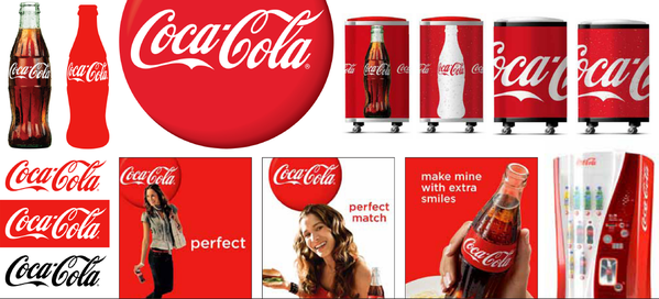
As long as PMS 484 is called out, the same Coke Red is printed every time.
Anyone can make a new color — by mixing pigments in different amounts, or by tweaking the finish, gloss, or texture of the material they’re printed on. But only after it is standardized and given a name does a color take on a true identity.
Pantone revolutionized colour communication by inventing a universal colour language.
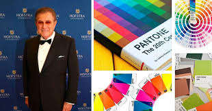
In 1963, Lawrence Herbert, Pantone’s founder, pictured below, created a color system of identifying, matching and communicating colors to solve the problems associated with producing accurate color matches in graphic arts. For the first time, brands and designers had confidence knowing their printers could understand and achieve the color they imagined.
 Herbert’s insight that the color spectrum is seen and interpreted differently by each individual led to his invention of the Pantone Color System – a book of standardized color in fan format. Since then, Pantone has expanded its color matching system concept to other color-critical industries, including digital technology, textiles, plastics, architecture and contract interiors, auto industry … and that’s the tip of the universe.
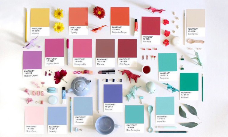
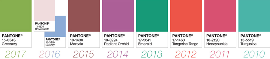
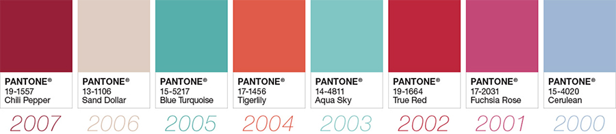
Since 2000, every year, usually in the fall, the Pantone Color Institute declares the “Color of the Year”.
How does this colour get chosen?
Twice a year — May and November — the company hosts, in a European capital, a secret meeting of representatives from various nations’ color standards groups. The group meets in a room with white walls so everyone can clearly see the objects their colleagues have brought as inspiration.
After two days of debate, they choose a color for the following year. The results of the meeting are published in Pantone View which fashion designers, florists, and many other consumer-oriented companies purchase to help guide their designs and planning for future products.
And the award goes to?
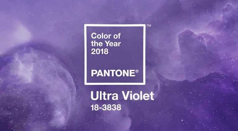
According to the Pantone Institute, this year’s Ultra Violet 18-3838 suggests originality, ingenuity and visionary thinking for the future and the discoveries that lie ahead.
“We are living in a time that requires inventiveness and imagination. It is this kind of creative inspiration that is indigenous to Pantone 18-3838 Ultra Violet, a blue-based purple that takes our awareness and potential to a higher level. From exploring new technologies and the greater galaxy, to artistic expression and spiritual reflection, intuitive Ultra Violet lights the way to what is yet to come. — Leatrice Eiseman, Executive Director, The Pantone Color Institute
Photos courtesy Pantone Color Institute