After “unveiling” its newly designed logo only a few days ago, Gap has hastily reinstated its previous logo after customers protested on various social networking sites.
Gap management, which had orginally tried to defend the redesign, eventually caved to many rather barbed comments from customer posting on the company's Facebook wall.
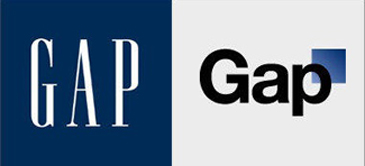
Hanaka then suggested Facebook users design their own alternative logos, but Gap fans stood their ground, effectively forcing the trendy teen-based retailer to admit its mistake and revert to the previous logo.
“We’ve heard loud and clear that you don’t like the new logo,” Hanaka admitted in a posting on Gap's Facebook page. “We’ve learned a lot from the feedback. We only want what’s best for the brand and our customers. So instead of crowd sourcing, we’re bringing back the Blue Box tonight.”
“We’ve learned a lot in this process,” Hansen added. “And we are clear that we did not go about this in the right way. We recognize that we missed the opportunity to engage with the online community.”